

What is UCare?
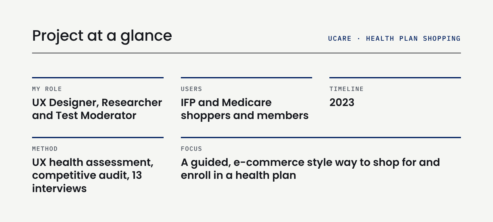
UCare is a nonprofit health plan provider in Minnesota that offers Medicare, Medicaid, and individual and family (IFP) plans. Its website explained those plans but didn’t let people shop for and enroll in one from start to finish. As UX designer, researcher and test moderator, I helped research how people shop for health plans and shape a blueprint for a guided, e-commerce style experience.
The Problem:
UCare’s site was hard to navigate, hard to search and hard to compare plans on. Prospective members couldn’t easily find the right plan, and the site had no clear path from learning about a plan to enrolling in it. Competitors were already offering more guided shopping experiences.
The Question:
How can we ensure that “people powered health plans” are delivered by people first experiences?
Research
Research Objectives
•Understand the existing pain points in the current experience.
•Discover how prospective members, members, brokers, and providers use the website.
•Prioritize features based on the needs of each individual audience.
•Gain a better understanding of how users search for information and purchase plans.
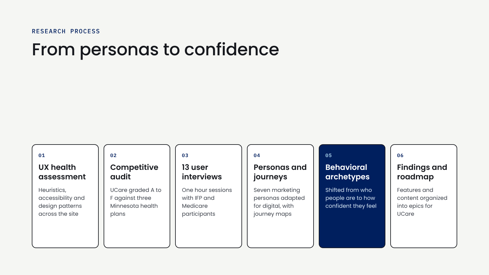
UX Health Assessment
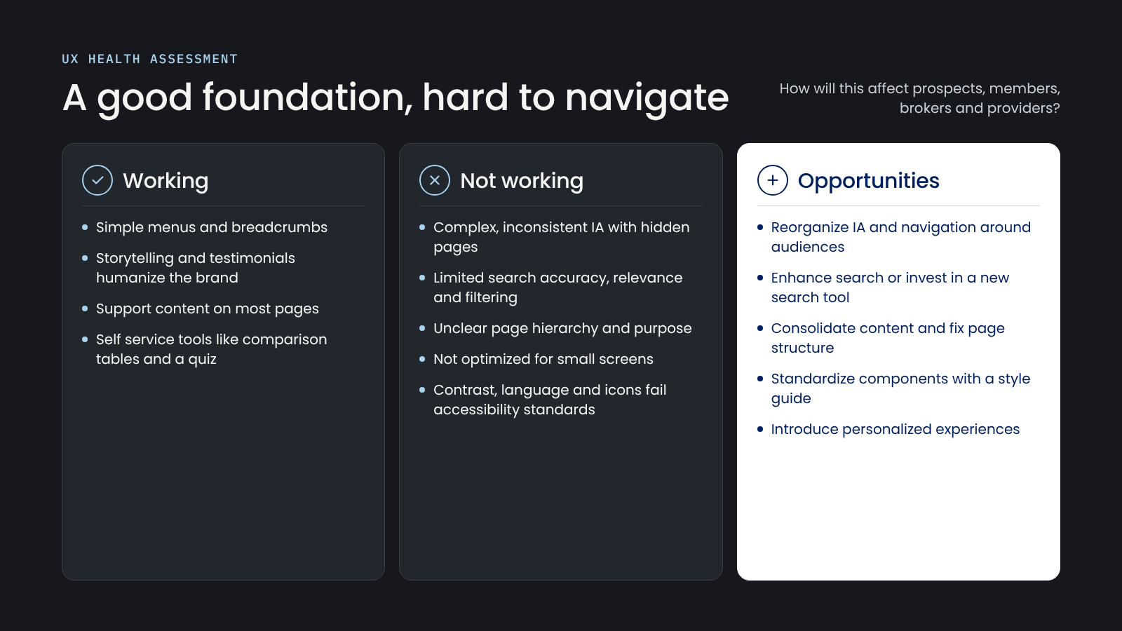
We started by reviewing the site against heuristics, accessibility standards and known design patterns. The foundation was solid, with simple menus, strong storytelling and helpful self service tools. But the information architecture was complex and inconsistent, search was limited, page purpose was often unclear, and parts of the site didn’t meet accessibility standards.
Competitive Audit
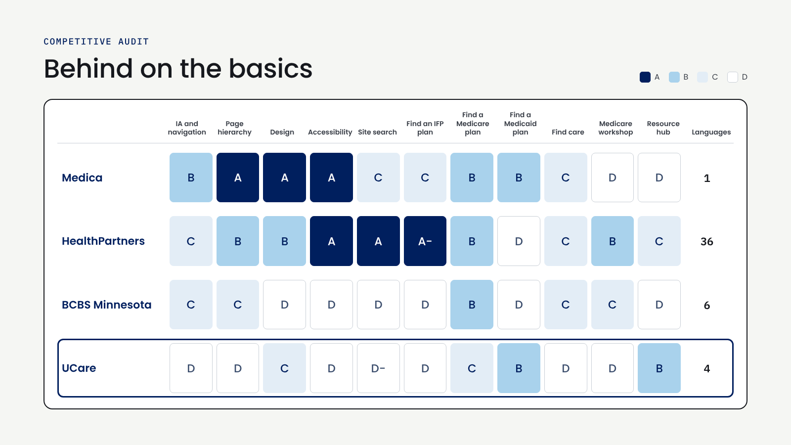
We graded UCare against Medica, HealthPartners and Blue Cross Blue Shield of Minnesota across 11 parts of the experience, on an A to F scale. UCare trailed on the basics: navigation, page hierarchy, accessibility, site search and finding an IFP plan. HealthPartners led on search and shopping, and Medica led on design and page structure.
We subjectively graded each of the experiences by topic and grades were assigned using the following A to F scale:
A: Among the best
B: Better than average
C: Average
D: Worse than average
F: Falling behind
User Interviews
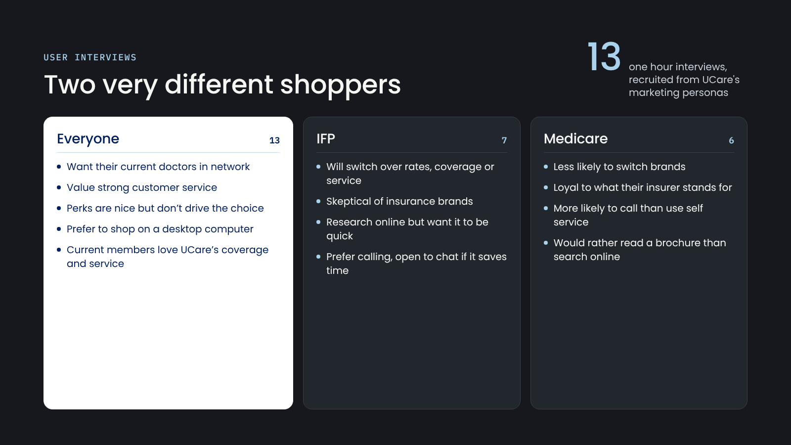
We ran 13 one-hour interviews, recruited from UCare’s marketing personas: seven IFP participants and six Medicare participants. Everyone wanted to keep their current doctors and valued strong customer service. IFP shoppers were skeptical of insurance brands, quick to switch and wanted research to be fast. Medicare shoppers were more loyal, more likely to call than use self-service, and often preferred printed materials.
Personas, Journeys and the Key Insight
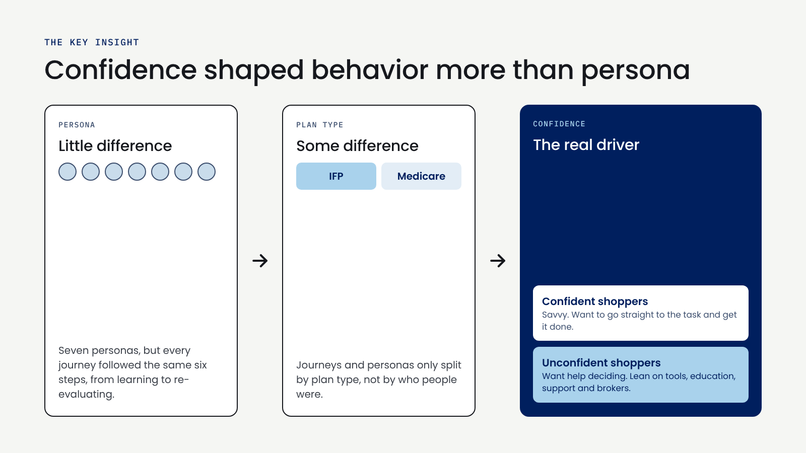
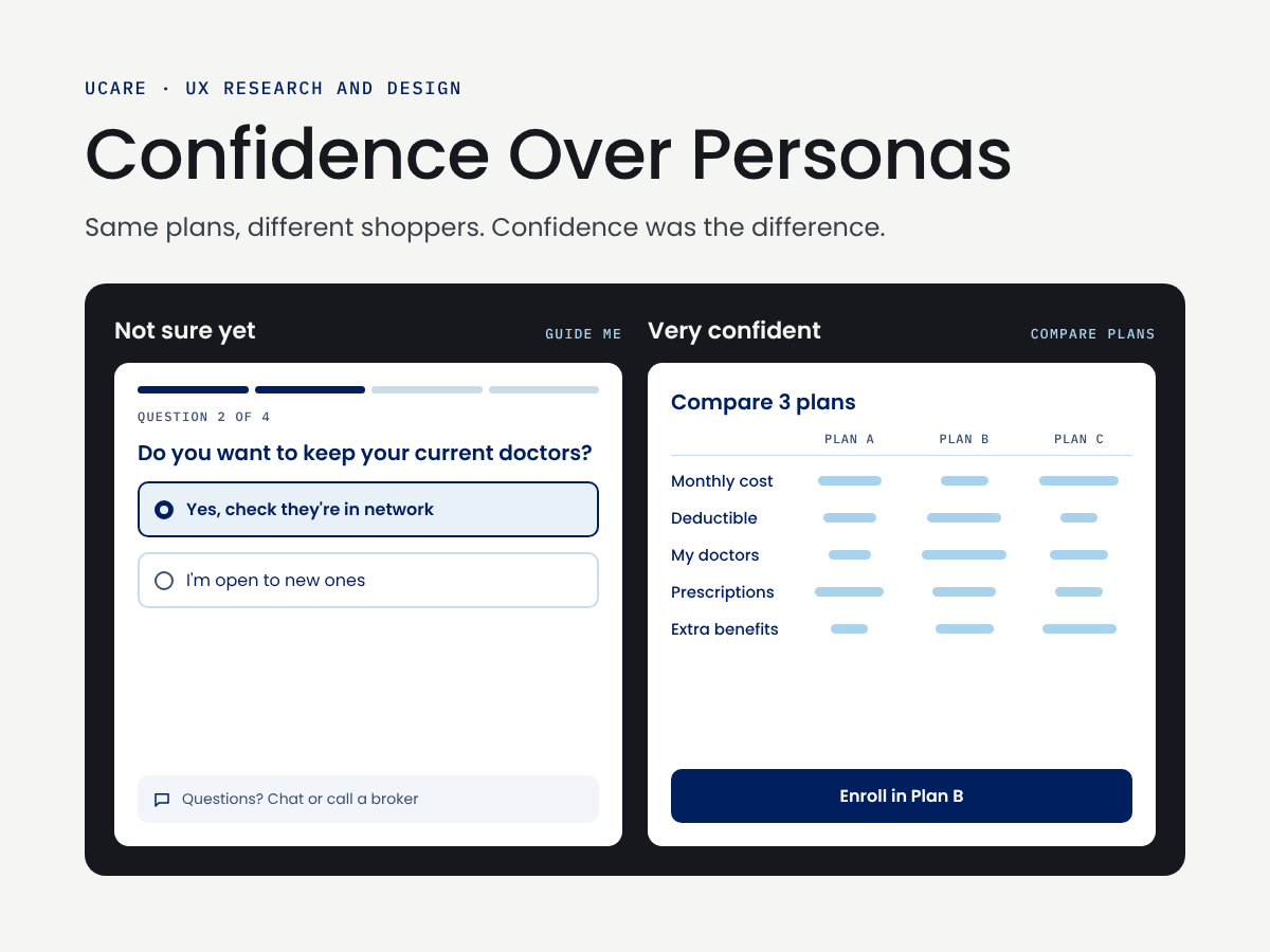
We adapted seven of UCare’s marketing personas for digital and mapped a journey for each. Every journey followed the same six steps, and the only real differences showed up between plan types, not personas. What actually changed behavior was confidence. Confident shoppers wanted to go straight to the task. Unconfident shoppers wanted help deciding and leaned on tools, education, support and brokers.


Behavioral Archetypes
When examining the digital experience related to personas, we found that the user’s confidence level affects their behavior more than which persona they are. Based on this finding, we shifted our focus away from the personas and toward Behavioral Archetypes. Behavioral archetypes convey the “who does what, when they do it, and why” of the audience. They focus on a group's needs, motivations, and pain points and capture how they think, feel, and act in particular situations or scenarios.
Key findings from this work included:
Confident users are savvier and want to directly complete the job (task) they are trying to do.
Unconfident users want more assistance and information to help them decide what is the best choice for them. They use more educational materials or digital tools, customer support, brokers, or would want to attend a meeting.
This insight led us to develop a model for how to consider which features and content would need to be considered for their specific behavioral style. From there, personas could be considered for personalization.
So, we developed behavioral archetypes related to each stage, plan type, and confidence level.

Findings and Recommendations
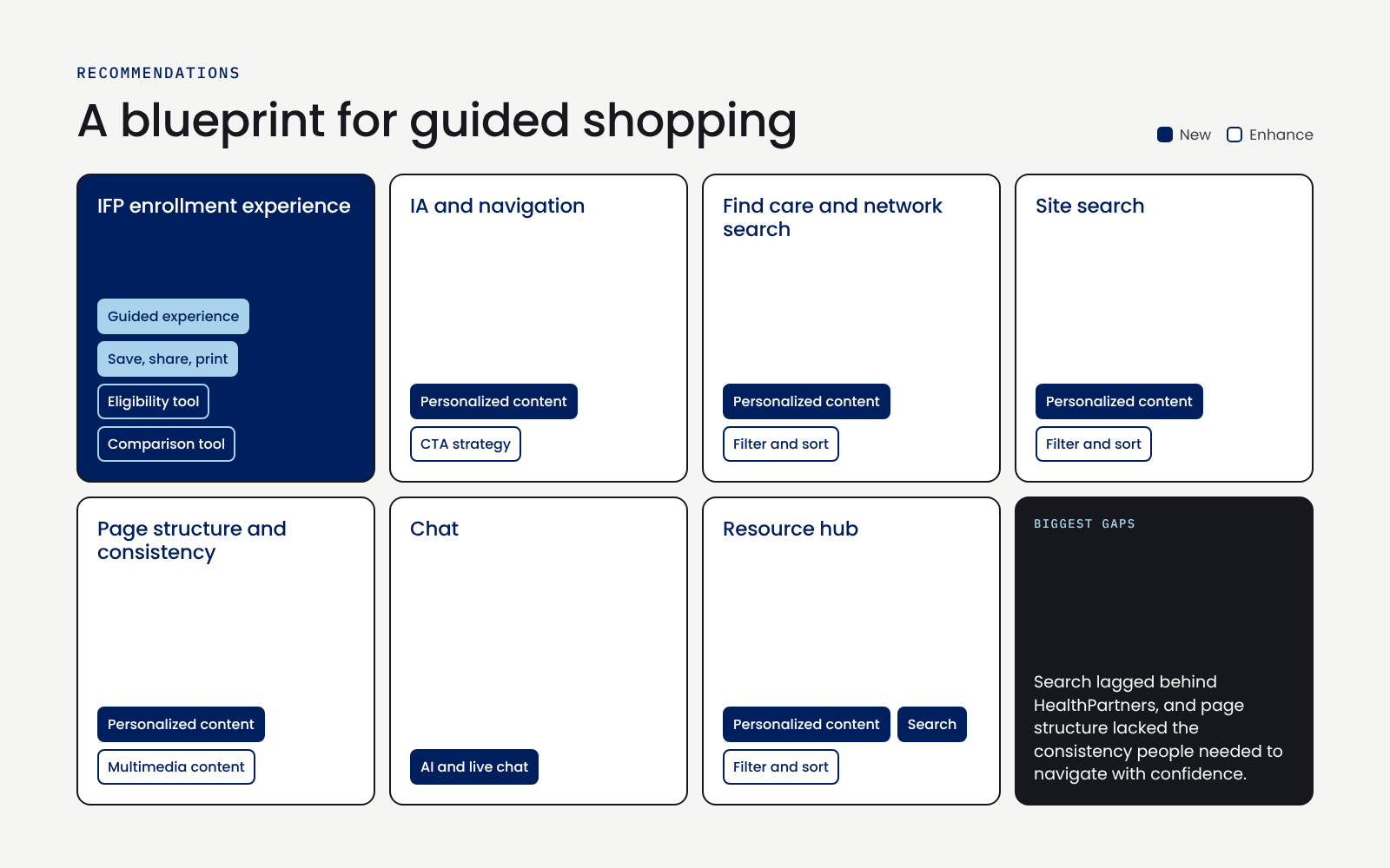
Across the assessment, the audit and the interviews, one opportunity stood out. UCare needed to move from a static information site to a guided shopping experience that adapts to how confident someone feels, not just who they are. We organized our recommendations into seven areas: IFP enrollment, IA and navigation, find care, site search, page structure, chat, and the resource hub. Search and page structure were the most urgent.


Outcome
The work was delivered to UCare stakeholders and their product team as a blueprint for how they planned to showcase health plans interactively in the future.
Reflection
The biggest lesson from this project was to hold personas loosely. We started with UCare’s seven marketing personas because that’s how the business saw its customers. But when we mapped their journeys, the personas kept collapsing into each other. The difference that mattered was how sure someone felt about choosing a plan, not their age, income or life stage. Letting the research overturn the framework we started with, instead of forcing the findings to fit it, led to the most useful outcome of the project. It gave UCare a simpler way to decide what to build: design for the confident shopper and the unsure one, then personalize from there.
I also learned how much the basics matter in a crowded market. UCare didn’t need flashy features to compete. Clearer navigation, better search and consistent pages would have closed most of the gap with its competitors. If I did this again, I’d test the archetypes with real shoppers early, to confirm that confidence holds up as the dividing line and to learn how people signal it on their own.


GCI- Yukon TV

BootUp

Code Championship