

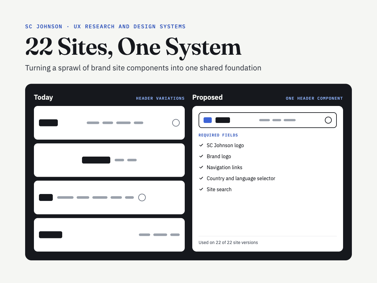
What is SC Johnson? What is the project?
SC Johnson runs dozens of consumer brand websites, including Glade, Ziploc, Windex, Raid, OFF!, Drano and Pledge. Over time, each site built its own versions of the same pieces: headers, product cards, heroes and search. The company wanted to move its brand sites onto one shared design system. As Lead UX Researcher, I partnered with a visual designer, a project manager and client partners to audit the brand sites and recommend which components and templates the new system should include.
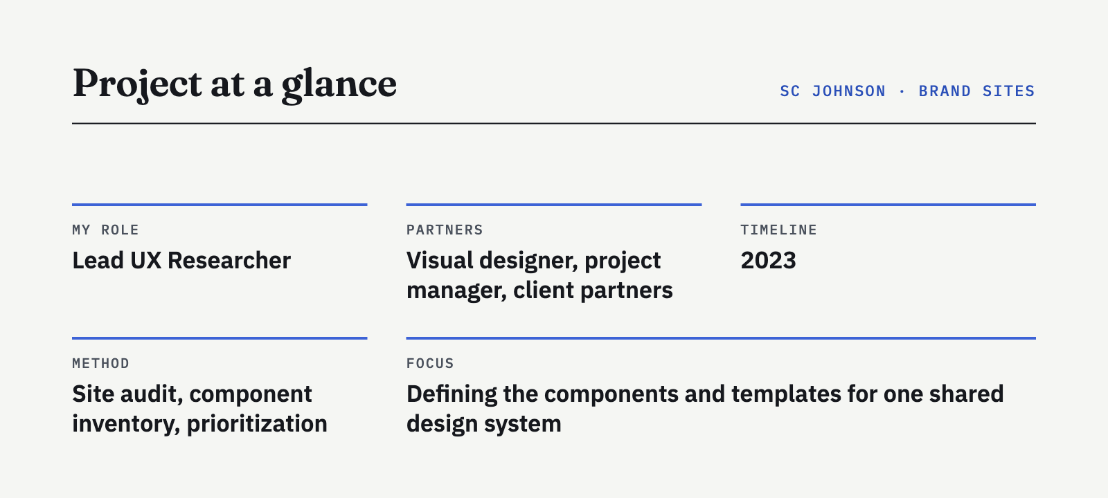
The Problem
With 22 brand site versions built separately, the same component could look and behave differently from site to site. Some sites had features others didn’t, some components didn’t work on mobile, and navigation varied from brand to brand. Building a shared system meant deciding what was truly needed, what could be combined, and what could go.
The Question: Which components and templates does a shared design system need to support every SC Johnson brand site, and how should each one work?
Research
Research Objectives
Inventory every template and component across the brand sites.
Understand how consistently each component was used and where it varied.
Prioritize components based on usage, user needs and business goals.
Define consistent fields and behavior for each component.
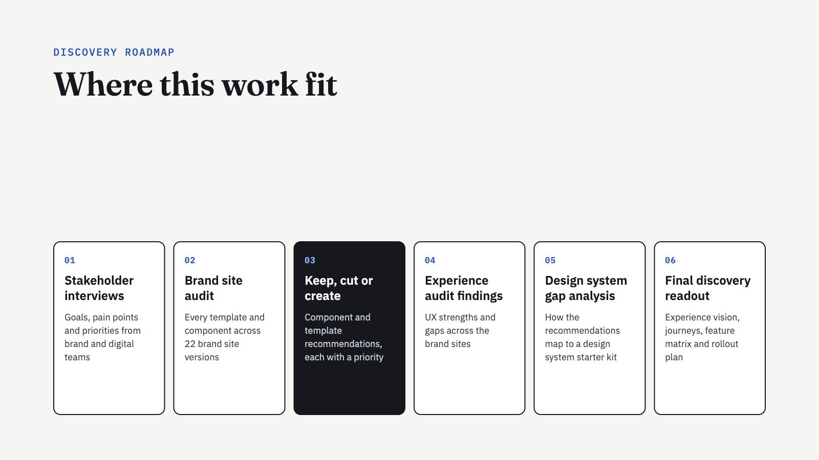
The Audit
We reviewed 22 brand site versions and mapped every page template, 13 types in all, from home pages and product listings to quiz results and search. Then we inventoried all 41 existing components. For each one, we tracked how many sites used it, pulled real examples from across the brands, and noted where design and behavior differed. Breadcrumbs, for example, were missing on mobile for some brands.
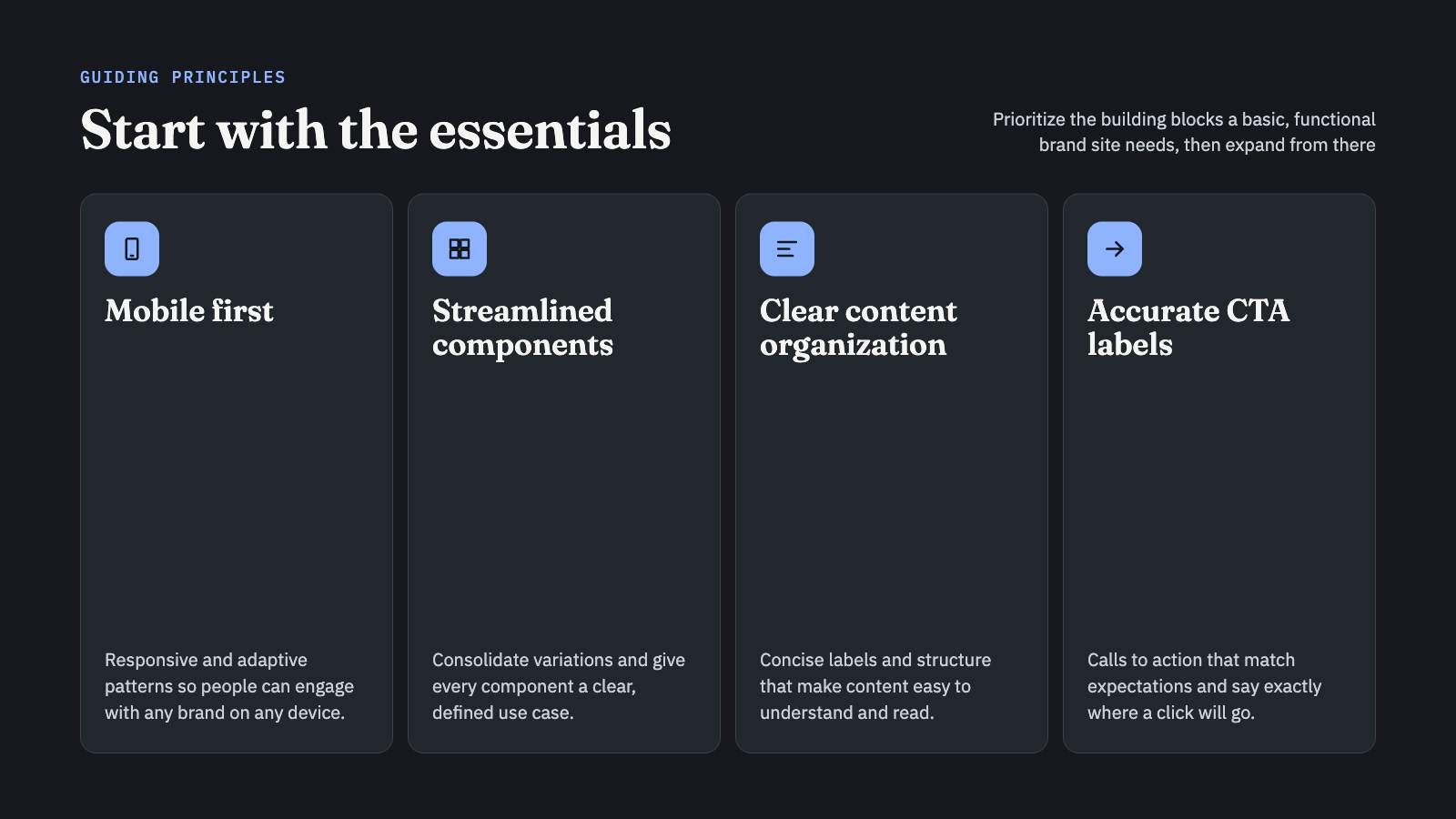
Guiding Principles
Four principles shaped every recommendation: mobile first, streamlined components with clear use cases, clear content organization, and calls to action that say exactly where they lead.
Common Isn’t Always Essential
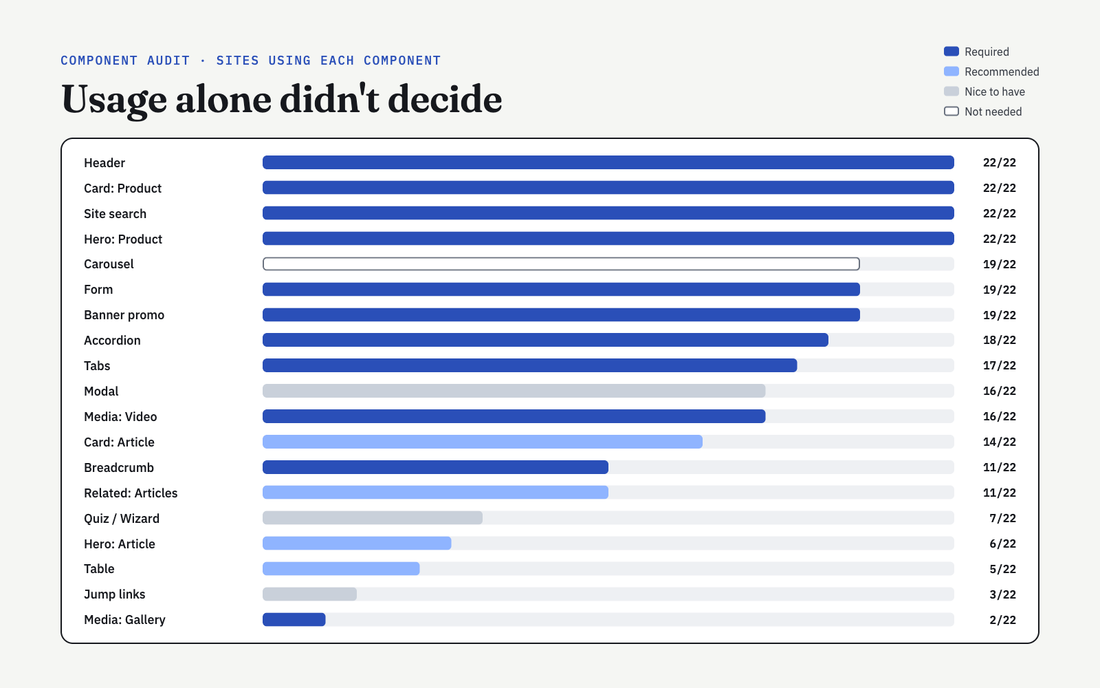
Some components appeared on every site, like the header, product card, product hero and site search. Others were rare, like jump links on 3 sites and social feed on another 2. But popularity alone didn’t settle anything. Carousels appeared on 19 of 22 sites, yet we recommended building carousel behavior into other components instead of keeping it as a standalone component. Quizzes appeared on 7 sites but showed low engagement, so they became nice to have.
Keep, Cut or Create components
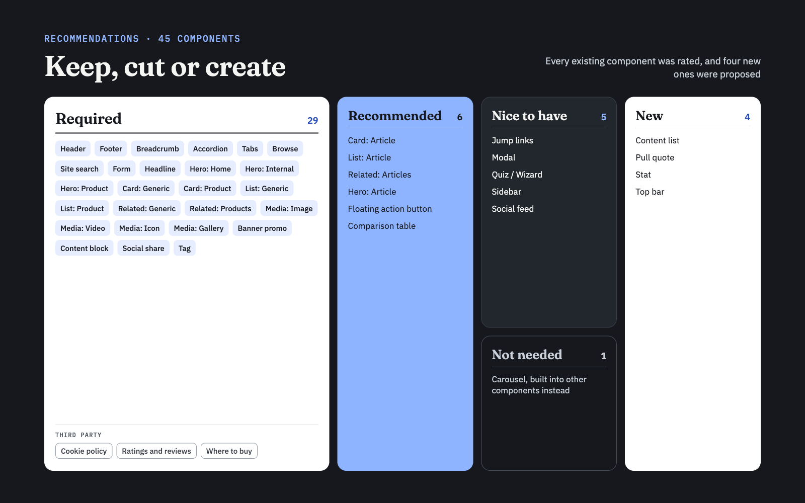
We rated all 45 components:
29 required, including 3 third party components: cookie policy, ratings and reviews, and where to buy.
6 recommended.
5 nice to have.
1 not needed.
4 new components: content list, pull quote, stat and top bar.
Defining Each Component
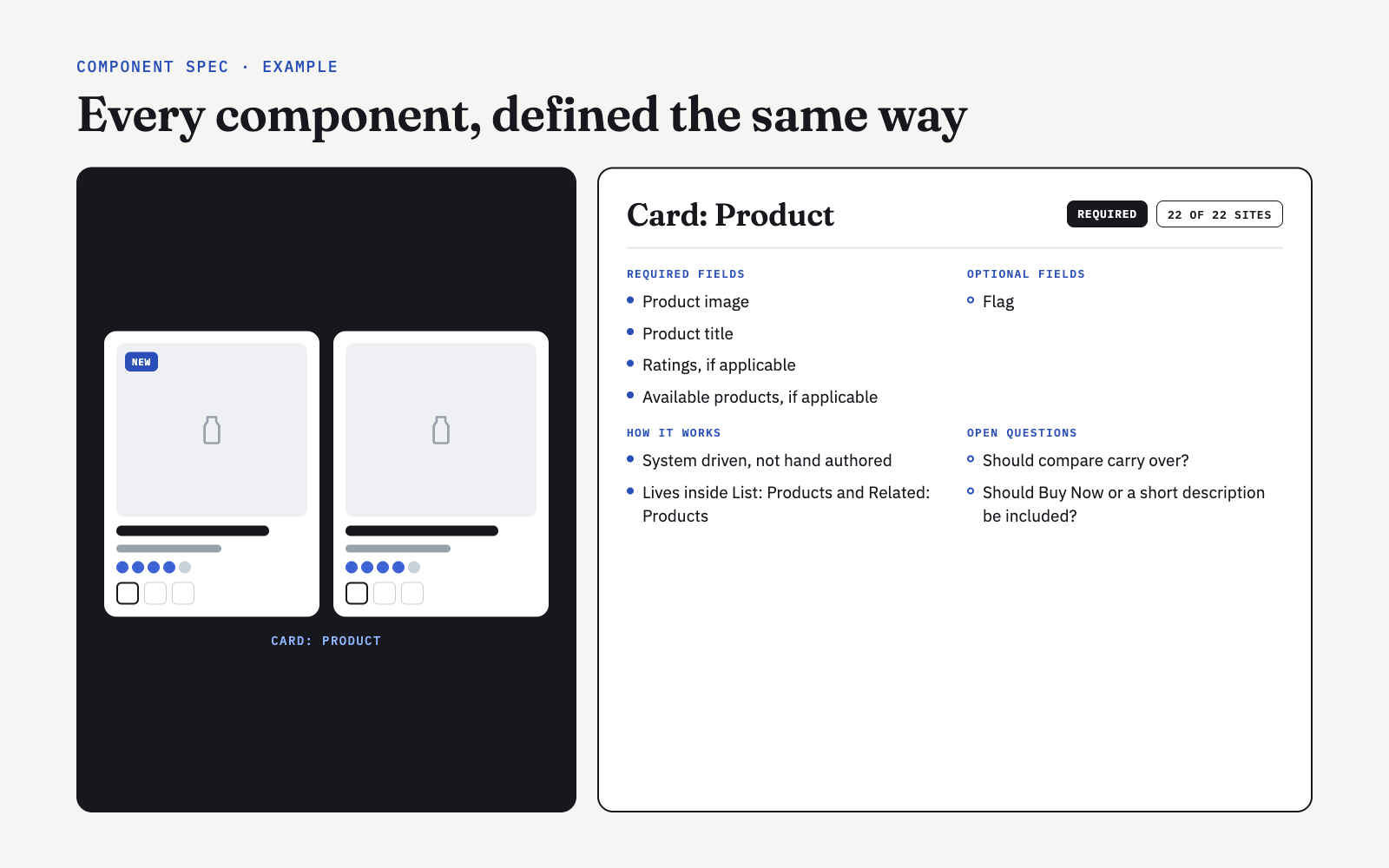
For every component, we documented required and optional fields, how it should behave, and open questions to resolve with the client. Using the same template every time gave the visual designer and developers a consistent starting point for the design system.
Recommendations
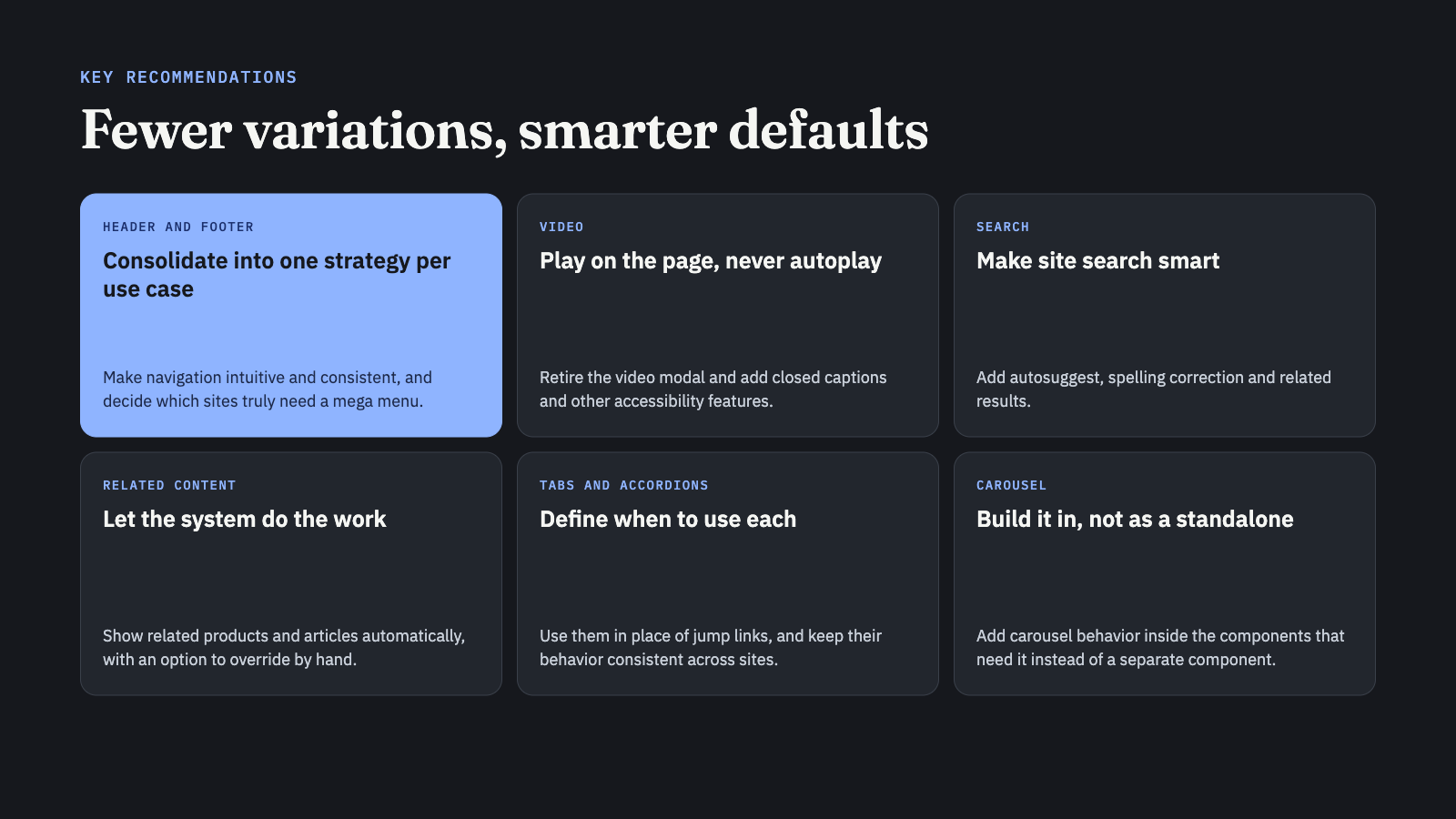
Consolidate headers and footers into one strategy per use case, and decide which sites need a mega menu.
Play videos on the page instead of in a modal, never autoplay them, and include captions.
Make site search smarter with autosuggest, spelling correction and related results.
Let the system show related products and articles automatically, with a manual override.
Define when to use tabs versus accordions, and use them instead of jump links.
Outcome
Before presenting to SC Johnson, we shared the recommendations with the development team to get their feedback on feasibility. We then proposed the full set of components and templates to SC Johnson. They agreed with the direction, and the design system was scheduled to begin build and deployment the following month.
Reflection
This project showed me that a design system starts with research, not design. Counting how often each component appeared across 22 sites was a useful first step, but the real decisions came from asking why a component existed and whether it actually helped people. A carousel on 19 of 22 sites still didn’t earn a place on its own, while a gallery used on only 2 did. Because we defined every component the same way and reviewed it with developers before presenting to SC Johnson, the visual designer, developers and client were all working from one shared picture. That made it easy for SC Johnson to say yes and move straight into the build. If I did it again, I’d bring in real usage data, like analytics and engagement, for more components, so priorities rest on how people use each site, not just on what each site has.
Outstanding questions
Third party components. How much design and UX flexibility is there for third party pieces like the cookie policy, ratings and reviews, and where to buy, so they feel consistent with the rest of the system?
Mega menus. Which brand sites have enough content to need a mega menu, and which are better served by simpler navigation?
Product card details. Should the product card include compare, a buy now button or a short description? What would each add for shoppers, and what would it cost in clutter?
Article metadata. Do article cards need author and date, or would that add noise for consumer brand content?
Tabs versus accordions. What rule tells authors when to use each, so content behaves consistently across every brand?
Privacy requirements. Which privacy and cookie guidelines need to shape forms and floating actions like social share and back to top?
Layout defaults. How many cards should appear per row in lists and related content, at each screen size?
Edge components. Do components like the sidebar and social feed earn a place once real designs are tested, or can they be cut?

GCI- Yukon TV

BootUp

Code Championship