

What is Disney Rewards?
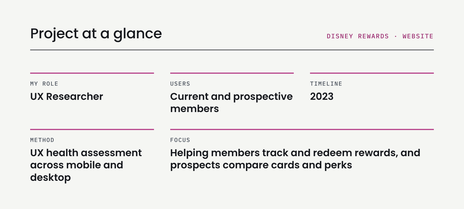
Disney Rewards is the rewards program behind the Disney Visa card. Its website is where current members track and redeem rewards, and where prospective members compare cards and explore perks. I assessed the site to find where it was making those tasks harder than they needed to be.
The Problem:
Members and prospects came to the site with clear goals: check rewards, redeem them, compare cards and find perks. But the site had grown in ways that made those goals hard to reach. Pages overlapped, labels didn’t match and key information was hidden.
The Question:
Can both members and prospects easily find what they need to track, redeem and explore their rewards?
Research
Research Objectives
• Understand the current state of the Disney Rewards site
• Identify UX wins, pain points and opportunities for members and prospects
• Build a foundation for an actionable plan and the future state of the site
Experience Assessment
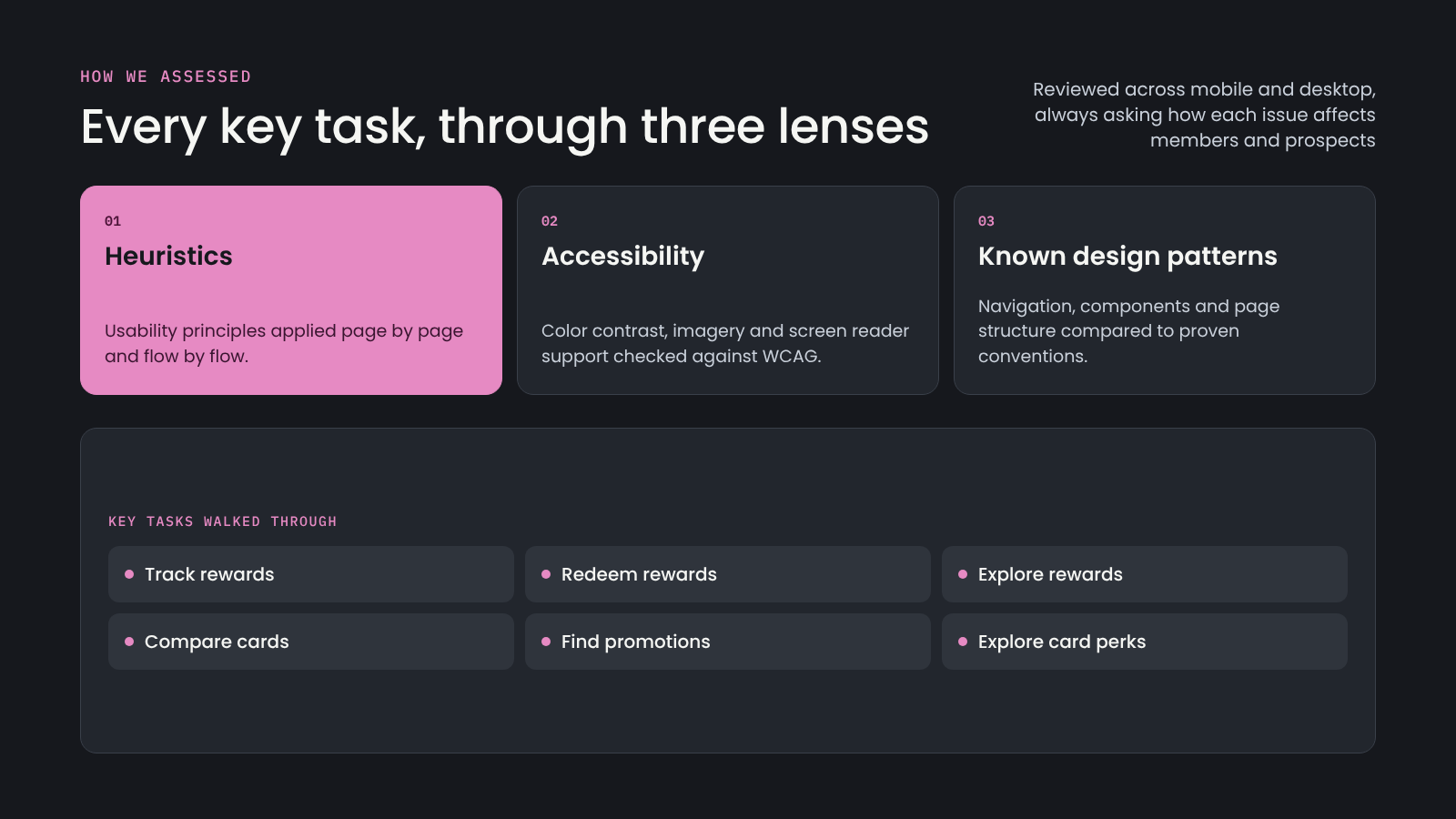
I walked through six key tasks: tracking rewards, redeeming rewards, exploring rewards, comparing cards, finding promotions and exploring card perks. I reviewed each task through three lenses (usability heuristics, accessibility and known design patterns) on both mobile and desktop.
What was Found
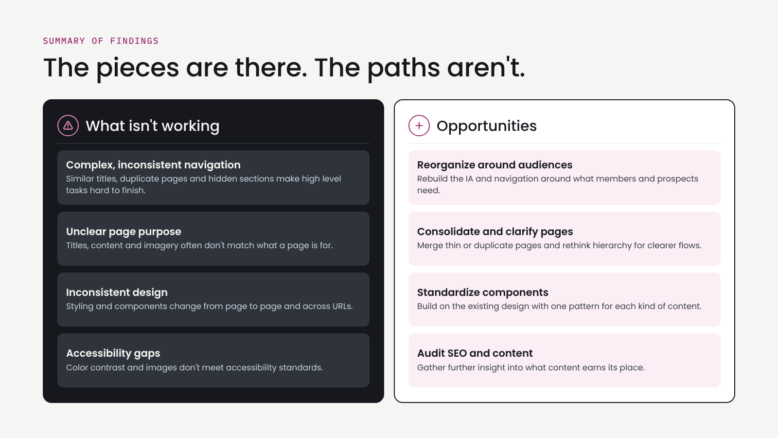
The pieces are there. The paths are not.
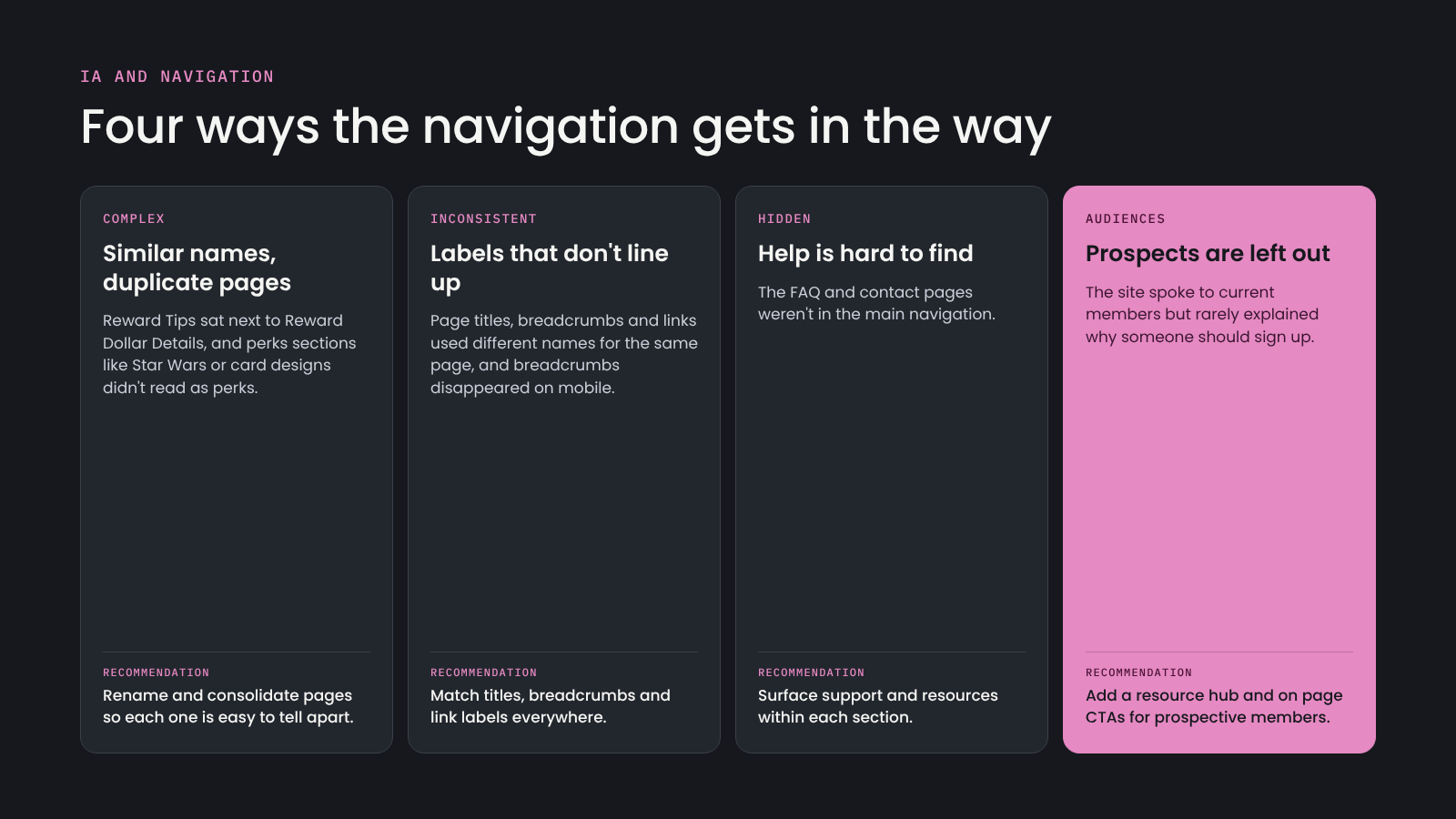
The site had the content people needed, but complex navigation, unclear page purpose, inconsistent design and accessibility gaps got in the way.
The navigation isn’t helping
What’s Next?
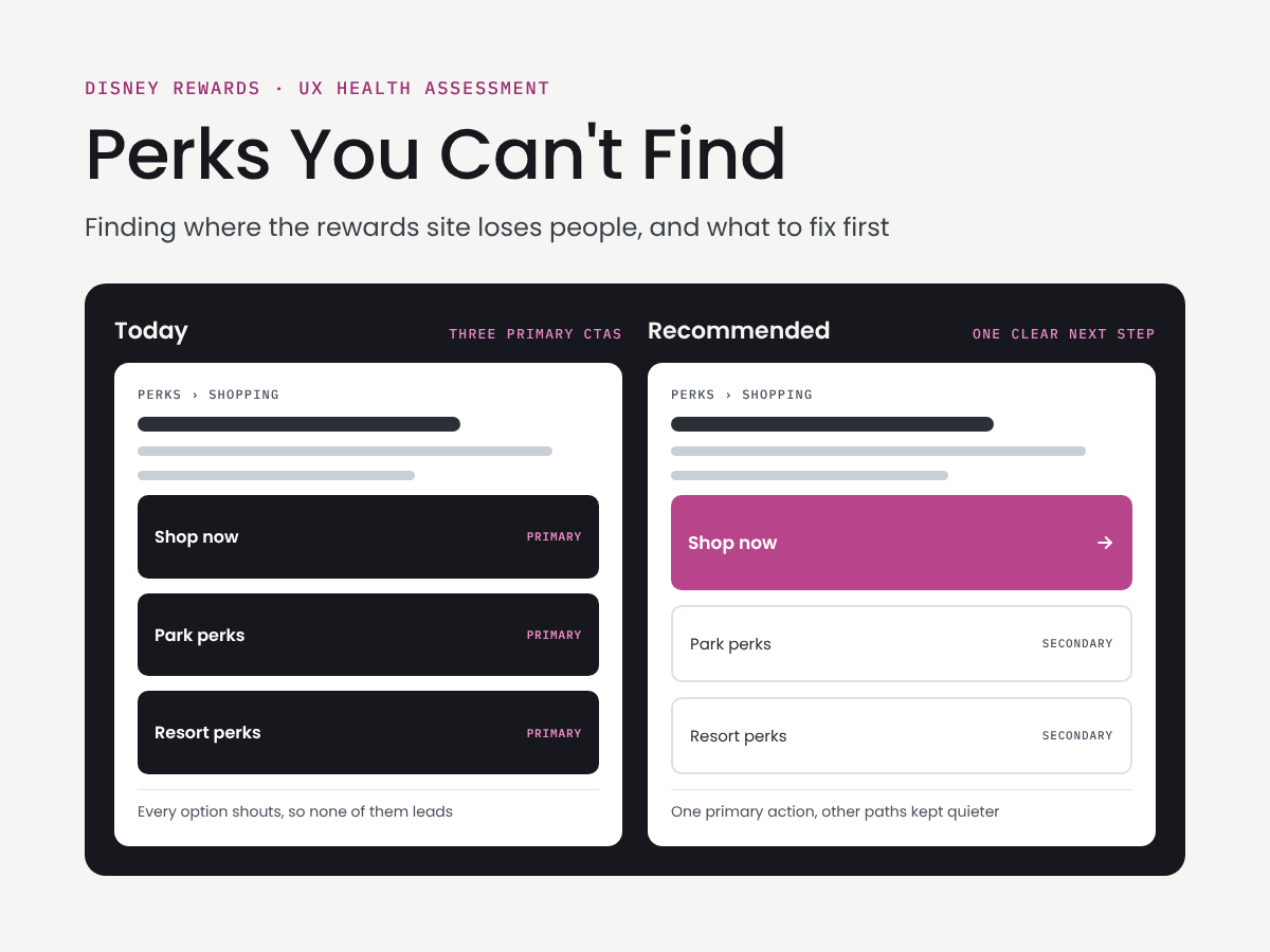
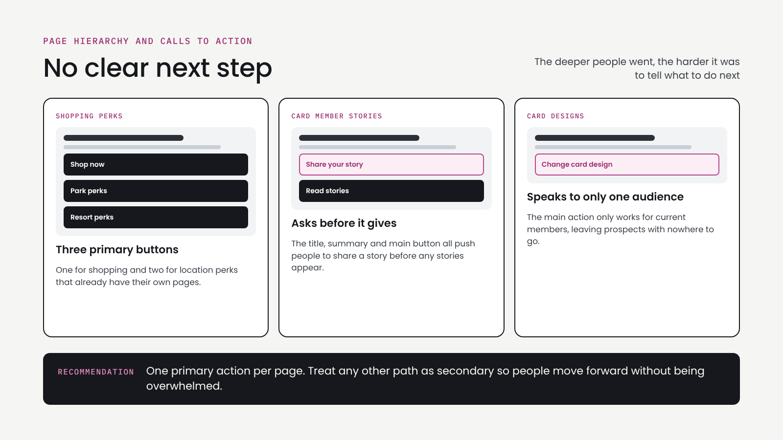
Pages often had several primary buttons, or a main action that only worked for current members. As people went deeper into the site, it got harder to tell what to do next.
Death by a thousand inconsistencies
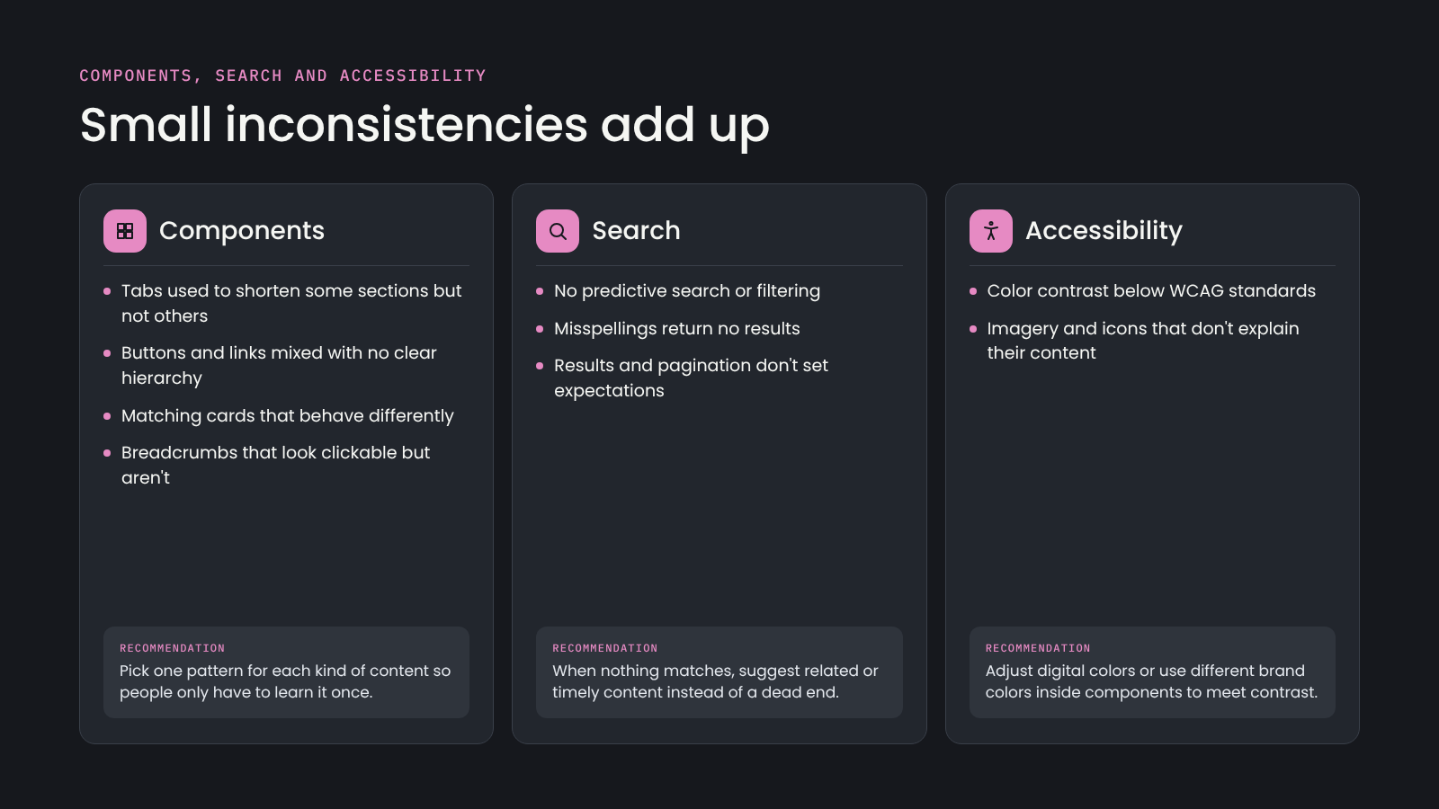
Tabs, buttons, cards and breadcrumbs behaved differently from page to page.
Search had no predictive results and returned nothing for misspellings.
Color contrast didn’t meet WCAG standards.
Recommendations
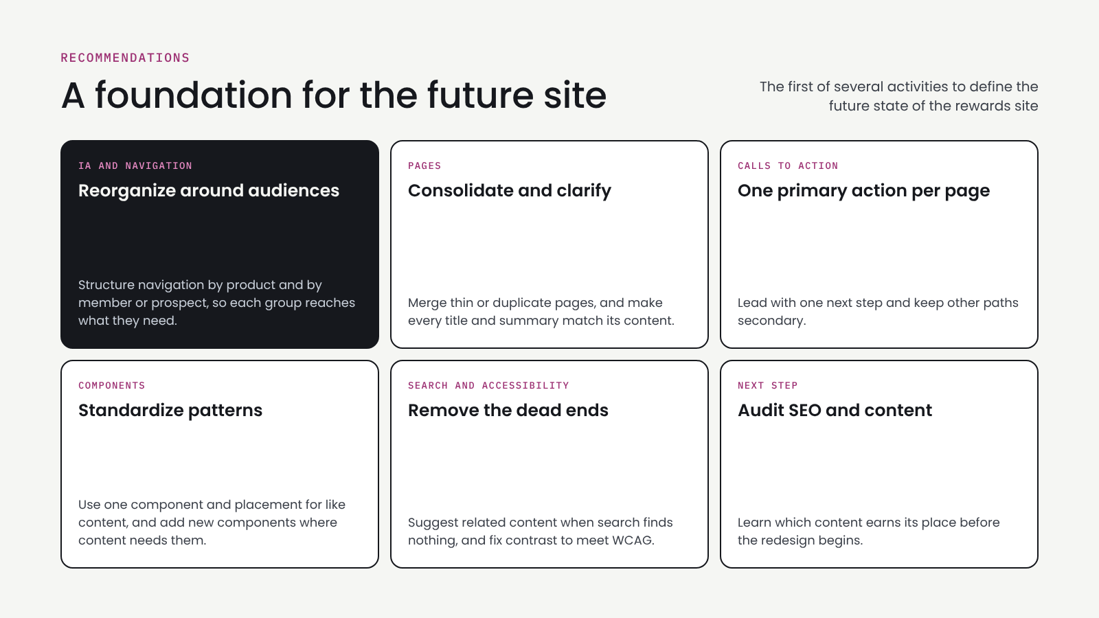
Reorganize the navigation around the audiences.
Consolidate and clarify pages.
Give every page one primary action.
Standardize components.
Remove dead ends in search and fix the color contrast issues.
Run an SEO and content audit next.
Outstanding Questions
What do prospective members need to see before they decide to apply for the card?
Which tasks matter most to the business, and do they line up with what members come to the site to do?
Where do people drop off today when they try to redeem rewards or compare cards?
How much of the site’s content is still relevant, and how much could be merged or retired?
Would reorganizing the navigation around audiences make sense to people who are both members and prospects for another card?

GCI- Yukon TV

BootUp

Code Championship